BKA Content Blog
Stay up to date with our most recent news and updatesThe Hidden SEO Problem That Content Couldn’t Fix
Sometimes an SEO campaign looks right on paper and still goes nowhere. The SEO strategy makes sense. The keywords are solid. The publishing schedule is consistent. The content is well written. Yet rankings do not move, traffic does not grow, and the campaign feels…
How to Track AI Traffic in Google Analytics (Step-by-Step Tutorial)
Key Takeaways: Learn how to build a custom GA4 Exploration report to uncover traffic from AI tools like ChatGPT, Claude and Perplexity. See how to use a Regex filter to isolate AI referral traffic that would otherwise stay buried in Google Analytics. Find out which…
BKA Content Co-Founder Speaks About SEO At Weber State University
The Weber State University Marketing Club recently welcomed Greg Secrist, co-founder of BKA Content, for a guest presentation on one of the biggest shifts happening in marketing today: the growing impact of artificial intelligence on digital marketing and SEO. Invited…
The SEO Strategy That Generated 15,000 Rankings
Many SEO campaigns rely heavily on backlinks to build authority. This one did not. A small university approached us because they needed more exposure for their nursing program. Their goal was to attract more prospective students through organic search. At the time,…
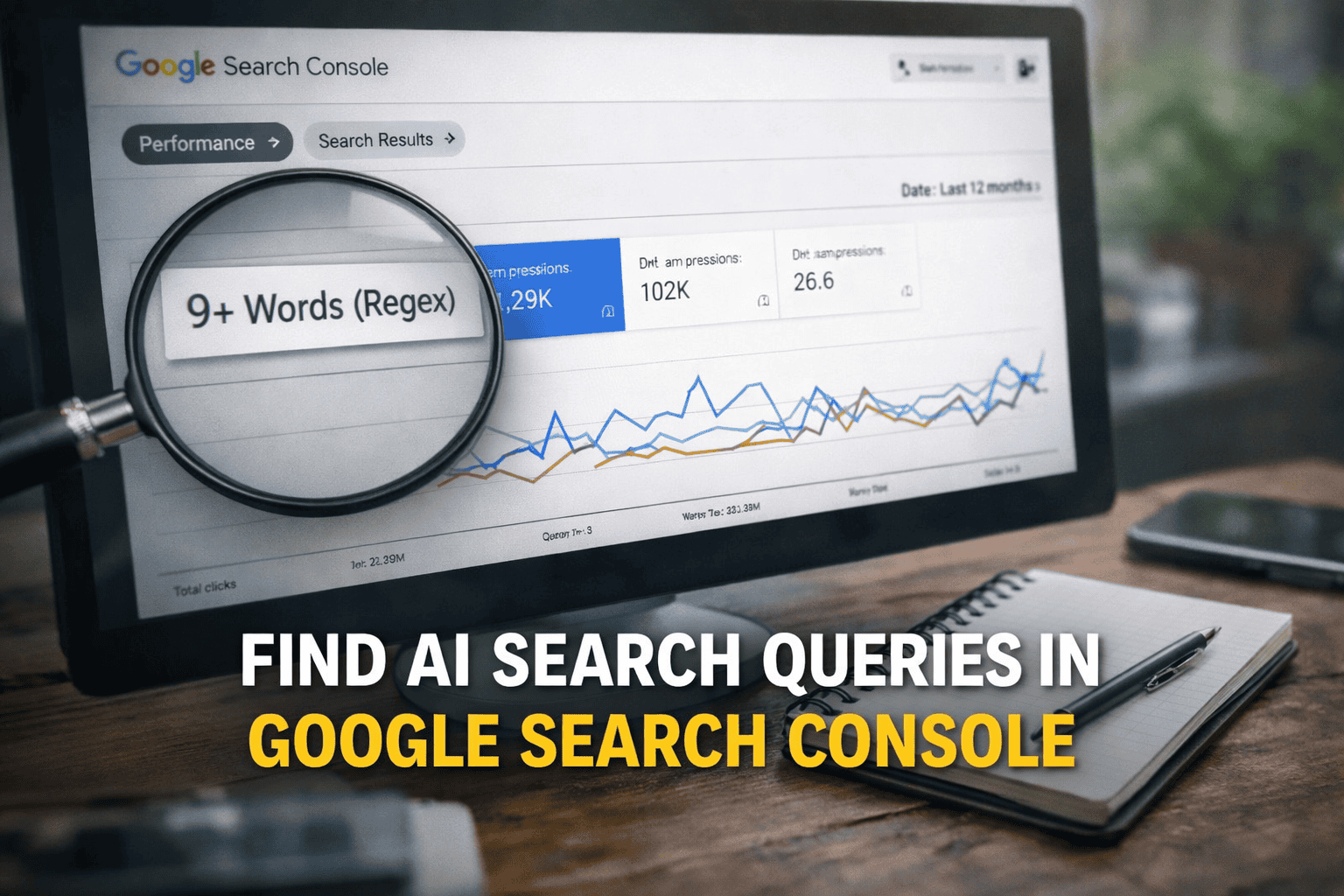
How to Find AI Search Prompts in Google Search Console
AI search is changing how people look for information. Instead of typing short phrases like “SEO services,” users now ask full questions such as: How do I know if my website is optimized for AI searchWhat is the best way to improve local SEO without hiring an agency…
Is Your About Us Page Optimized for SEO?
If someone searched, “What does your business do?” would Google answer correctly? Most business owners assume Google pulls that answer from the homepage. But more often than you might think, Google surfaces the About Us page in search engine results very first. Not…
Can You Get Banned From Google?
Google is one of the most widely used search engines on the Internet. In fact, there are approximately 8.5 billion searches done on Google every day. Companies spend thousands of marketing dollars every year on SEO, white-hat link building, website design and…
AI Ranking Is Chaos: What the Latest Study Means for Brands
If you ask ChatGPT for the “best headphones” 100 times, you will almost never get the same list twice. Not slightly different. Not one brand swapped out. Statistically, almost never the exact same response. Yet brands are spending millions of dollars trying to rank in…
How To Add Keywords to a YouTube Video
Do you know how YouTube ranks videos? While it’s fairly common knowledge that learning how to add keywords to a piece of written content can boost SEO, many creators don’t realize that optimizing video content to rank higher in search results on YouTube and Google is…


